Reading Causal Inference in Python — Part 1: Fundamentals
Why causal questions need more than a predictive model.
AUTHOR
Nathan Horvath
PUBLISHED
2026-04-05
I'm reading Causal Inference in Python by Matheus Facure and writing about its key takeaways I find most useful for applied work. I'm aiming to solidify my existing understanding and help others avoid common pitfalls.
Causation Is a Missing Data Problem
Causal inference answers "what if" questions. What happens to disease outcomes if we administer a new vaccine? What happens to sales if we run an ad campaign? These questions ask about the effect of a treatment on an outcome.
Predictive models can't answer these questions. They learn associations from historical data, and those associations reflect who selected into treatment, not what the treatment does. A predictive model trained on tutoring and test scores might learn "students who receive tutoring perform worse" because struggling students seek tutoring more often. If you use that model to decide who gets tutoring, you'll withhold help from the students who need it most.
This failure points to the fundamental problem of causal inference: for any unit (person, business, patient) that received treatment, we never observe what would have happened without treatment. We see the tutored student's score. We don't see the score they would have had without tutoring. That counterfactual is missing data. Causal inference is, at its core, a missing data problem.
Causality with Perfect Data
Imagine you have access to a time machine. You can use it to give or withhold tutoring from six students and observe their final grades in both scenarios.
$T$ indicates whether the student received tutoring. $Y$ is the observed grade. $Y_0$ and $Y_1$ are the grades without tutoring and with tutoring respectively. The time machine lets us see both, but in reality, we'd only observe one.
| Student | Struggling | $Y_0$ | $Y_1$ | $T$ | $Y$ |
|---|---|---|---|---|---|
| A | No | 85 | 90 | 0 | 85 |
| B | No | 80 | 85 | 0 | 80 |
| C | No | 75 | 80 | 1 | 80 |
| D | Yes | 60 | 70 | 1 | 70 |
| E | Yes | 55 | 65 | 1 | 65 |
| F | Yes | 50 | 60 | 0 | 50 |
With both potential outcomes visible, we can compute the true average treatment effect (ATE): the mean of $Y_1$ minus the mean of $Y_0$.
$$ATE = E[Y_1] - E[Y_0] = 75 - 67.5 = 7.5$$
We can conclude that tutoring improves grades by an average of 7.5 points.
Reality Without the Time Machine
But time machines don't exist. In reality, we only observe one outcome per student.
| Student | Struggling | $Y_0$ | $Y_1$ | $T$ | $Y$ |
|---|---|---|---|---|---|
| A | No | 85 | ? | 0 | 85 |
| B | No | 80 | ? | 0 | 80 |
| C | No | ? | 80 | 1 | 80 |
| D | Yes | ? | 70 | 1 | 70 |
| E | Yes | ? | 65 | 1 | 65 |
| F | Yes | 50 | ? | 0 | 50 |
Those question marks are the counterfactuals, and they turn causal inference into an imputation problem. Without filling them in, we can't compute $E[Y_1]$ or $E[Y_0]$. The naive approach is to compare observable group averages: the mean grade of tutored students ($E[Y|T=1]$) minus the mean grade of untutored students ($E[Y|T=0]$).
$$E[Y|T=1] - E[Y|T=0] = \frac{80 + 70 + 65}{3} - \frac{85 + 80 + 50}{3} = 71.7 - 71.7 = 0$$
This naive estimate says tutoring has no effect, but the true ATE is 7.5. What went wrong?
Bias Made Legible
In observational data, treatment isn't random. The factors that determine who gets treated often also affect outcomes.
Look at the "Struggling" column. Struggling students are more likely to seek tutoring. They also perform worse than non-struggling students regardless of treatment. These pre-existing differences create bias: part of the observed gap in outcomes comes from who selected into treatment, not from the treatment itself.
The bias equation makes this precise:
ATT (average treatment effect on the treated) measures the effect only among units that received treatment. The bias term compares what the two groups would have scored without treatment. Notice that $E[Y_0|T=1]$ is one of our question marks: the counterfactual we cannot observe.
Using our time machine data, we can calculate ATT:
$$E[Y_1|T=1] - E[Y_0|T=1] = \frac{80 + 70 + 65}{3} - \frac{75 + 60 + 55}{3} = 71.7 - 63.3 = 8.3$$
And the bias:
$$E[Y_0|T=1] - E[Y_0|T=0] = 63.3 - 71.7 = -8.3$$
The tutored group would have scored lower than the untutored group anyway. This negative bias cancels the positive treatment effect, producing a naive estimate of zero.
No Model Rescues Bad Assumptions
Causal inference has two steps: identification and estimation. Identification determines whether your assumptions about treatment assignment let you impute those missing counterfactuals. Estimation informs which algorithm computes the causal effect from data. Machine learning practitioners focus on estimation: models, hyperparameters, validation. But estimation only matters once identification holds. A deep neural network trained on confounded data produces a precise wrong answer.
Randomization is the strongest identification strategy. Random assignment breaks the link between pre-existing characteristics and treatment. In our tutoring example, randomization would make struggling and non-struggling students equally likely to receive tutoring. With bias eliminated, the naive comparison of group means reveals the true treatment effect.
When randomization isn't possible, identification requires assumptions about how treatment was assigned. If Struggling is the only factor driving treatment selection and grades, we can adjust for it by comparing students within each category. If unobserved factors like motivation also drive selection, our estimate remains biased no matter how sophisticated the model.
No algorithm will rescue you from unmeasured confounding. Identification is the hard part.
Significant Doesn't Mean True
At Airbnb Search, 26% of statistically significant experiment results are estimated to be false positives. The standard 0.05 threshold doesn't prevent false positives at that rate, even with properly powered experiments, because the false positive rate depends on your organization's historical success rate.
A p-value is $P(\Delta \text{ observed or more extreme} | H_0 \text{ is true})$: the probability of seeing data this extreme, assuming no real effect. Practitioners commonly misread it as the opposite conditional, $P(H_0 \text{ is true} | \Delta \text{ observed})$, the probability the null holds given the data. Practitioners and even A/B testing vendors commonly make this error.
The precise definition still doesn't answer what practitioners actually need to know. The useful quantity is FPR: $P(H_0 \text{ is true} | \text{statistically significant result})$, the probability a significant result is a false alarm. FPR requires Bayes' Rule and a prior: your organization's historical share of experiments with no real effect, $\pi = P(H_0)$. If only 15% of your experiments find real effects, $\pi = 0.85$:
$$P(H_0 | SS) = \frac{(\alpha/2)\pi}{(\alpha/2)\pi + (1 - \beta)(1 - \pi)}$$
where $\alpha = 0.05$ and $1 - \beta = 0.80$. At Bing's 15% success rate, FPR = 15%, three times the nominal 5%.
The first two columns below are adapted from Kohavi et al. (2022); the third shows the p-value threshold required to achieve a true 5% false positive rate at each success rate.
| Company / Source | Success Rate | FPR (at p=0.05) | p-value for FPR ≤ 5% |
|---|---|---|---|
| Microsoft | 33% | 5.9% | 0.042 |
| Bing | 15% | 15.0% | 0.015 |
| Airbnb Search | 8% | 26.4% | 0.007 |
Without historical data, use industry benchmarks as a proxy and adjust your threshold accordingly. At typical success rates of 10-15%, achieving a true 5% false positive rate requires p < 0.01, not p < 0.05.
The Hidden Graph
Every causal analysis encodes assumptions about how the world works. Most analysts never write them down.
In the tutoring example, comparing group means without any adjustment was a claim: there are no confounders, no factors that drive both who gets tutoring and how students perform. Controlling for Struggling was a better claim, but still a claim: that Struggling is the only such factor. If motivation or parental support also drive selection into tutoring, the estimate is still biased; controlling for Struggling alone isn't enough.
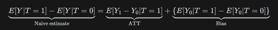
A directed acyclic graph, or DAG, is a way to draw these claims out. Each arrow represents a causal relationship. Each missing arrow claims no direct causal relationship exists.
Reading the Map versus Making It
Drawing a DAG and reading one are two very different problems.
The first is to take one as given. The causal structure is already settled, so the identification task is mechanical. Drawing the graph makes backdoor paths visible: the non-causal routes that connect treatment to outcome through confounders rather than directly through the treatment itself. Block those confounders by conditioning on them, and what remains is the causal effect.
The harder mode is building one from scratch. There is no answer key. To construct the tutoring DAG, you would need to ask: what actually drives a student to seek tutoring? A teacher's recommendation, parental pressure, a student's own awareness of their struggles, the stability of their home environment? Each candidate is a potential node. Each relationship between candidates is a claim about how the world works. Missing a node means assuming it has no effect. Including a wrong edge means assuming a causal relationship that doesn't exist.
The DAG above reflects one attempt. Most analysts assume more controls mean a more rigorous analysis. The DAG shows that's wrong in two specific ways. Study Habits is a mediator — it sits on the causal path between Tutoring and Grade, meaning part of tutoring's effect on grades flows through it. Condition on it and you block a portion of the effect you're trying to measure.
After School is a collider — both Struggling and Parental Involvement cause it. Condition on it and you open a spurious association between those two variables that wasn't there otherwise. Neither is a safe control, and without the graph, that distinction remains invisible.
To isolate the causal effect of tutoring on grades, you need to condition on Struggling and Home Environment to block all backdoor paths, or non-causal paths. Leave either out and the estimate is biased.
In a randomized controlled trial, this complexity evaporates. Randomization severs all incoming arrows to Tutoring. The backdoor paths disappear and group means can be compared directly. When randomization isn't possible, none of that is given. The graph has to be built from domain knowledge the data scientist doesn't have. That means handing it to the people who do.

Why Explicit Beats Implicit
Domain experts don't speak DAG. They can't immediately validate graph notation, but they can answer one question at a time: does X cause Y?
Each edge is a statement that can be challenged. A school counselor looks at the tutoring graph and says: "Kids in after-school programs get structured homework time. That builds study habits directly." That adds a new edge, After School → Study Habits, and a new path to account for in the model.
A teacher pushes further: "You're missing peer influence entirely. Students with friends already in tutoring programs are far more likely to join. Plus, motivated peers improve grades regardless of tutoring." That's a new confounder: Peer Influence → Tutoring and Peer Influence → Grade. Leave it out and the estimate is biased.
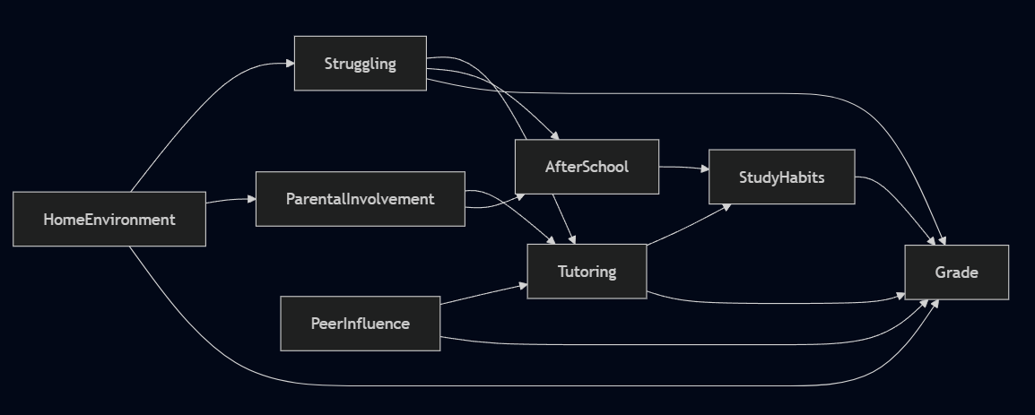
That's the point of drawing the graph. A hidden assumption can't be challenged. An explicit one can be handed to a teacher, a counselor, or any subject matter expert and interrogated edge by edge, node by node. The DAG doesn't have to be correct at the outset. But it has to be specific enough that someone can tell you where it's wrong. The graph gets better through conversation, not computation.